

InstaShop is an app that allows tech-savvy consumers to grocery shop from their smart phones. It provides the option to shop from either a traditional InstaShop storefront location or the area’s local farmer's market. For grocery delivery, choices include the ability to set up an "at-home" grocery drop-off or self-pickup at the store utilizing curbside delivery - all through the use of an easy-to-use, seamless user interface.
My role: To research, design and test all UIs related to the project. I collaborated and received counsel from my mentor, Nikki Oettinger, to develop this project.

Brick and mortar stores have to compete like never before with online markets to stay relevant in today's economy.
InstaShop, a fictitious grocery store franchise based in the United States, faces this dilemma. Although their customer satisfaction ratings have remained relatively constant over the last 4 years, their market shares have been decreasing by 8% each year. If they continue at this rate for another year or two, they will have to shut their doors.
They are currently searching to see how big the online marketspace is and how best they can be a part of this technologically flourishing arena.
The Challenge
My tasks for the following project:
Conduct market research on current available online grocery shopping apps & websites
Design a mobile application as well as a responsive landing page for the InstaShop website (Desktop,Tablet & Mobile)
Rebrand current InstaShop logo to reflect the current logo/logotype trends
Research & Strategy
The purpose of this research plan is to discover and study grocery store shoppers' behaviors; thereby uncovering current shopping benefits (as well as issues). This will allow for the research methods, once placed, to phase out any existing problems.
Research Goals
Gain empathy with customers and find out what works for them in a traditional grocery store and what could translate over to an online application
Conduct competitor analysis to discover what other online shops are doing with success
Research Questions
What do customers enjoy/dislike about the physical method of shopping?
How often do customers go out shopping?
Why do some customers prefer going to the store?
What do customers like about online shopping and why?
- What do customers dislike about online shopping and why?
Research Methodology
Competitor Analysis
Customer Interviews
Customer Surveys
Gaining Empathy
To connect with potential Instashop users (gaining empathy), I asked several grocery shoppers questions about their current shopping experiences. Three of the participants' answers helped shape the following persona in "Wanda Nichell".
Creating A Persona
It was important to understand the needs of the user in effort to develop a useful and functional Instashop app. Once I started to empathize with the shoppers by gathering data collected from user interviews and surveys, I was able to craft a "typical" user for the InstaShop app - the archetype of a busy professional. This hard-working mom is the type of persona that InstaShop is targeting for their online service.
Wanda Nichell's InstaShop Persona
Empathy Map
An empathy map was then created based on the user persona. This allows me to gain a deeper insight into the customers - or in this case the persona of Wanda.
Wanda Nichell's Empathy Map
Storyboards
A storyboard created through Pixton.com shows the user in context. With it, we are able to witness our user in the problem space of focus. Not only do we see what she is doing, but also where she is doing it.
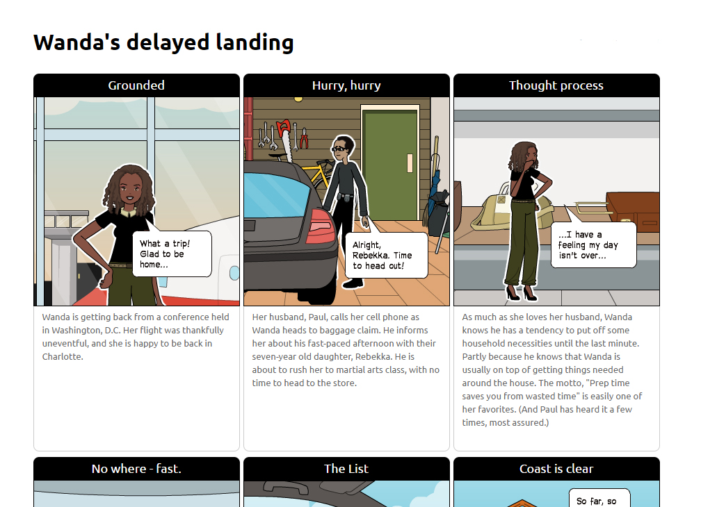
To see the complete storyboard, visit: http://Pixton.com/ic:0nvdovu7
Interaction Design
Card Sorting
In an effort to help me to create and evaluate the information architecture of the InstaShop app, I sought out the use of the card sorting method. If I could understand how the users think and talk about elements of the app, I can then organize and label the content to make sense to the users. I chose 24 from the 100 items InstaShop wants to sell through the app and set them to be sorted and labeled independently by a few participants willing to assist me with this research.
It was an interesting exercise that ended up teaching me that organizing items and creating actual categories isn't as arbitrary as the average shopper (myself included) may think and takes a lot of work and thoughtful planning.

Card sorting at it's best with Post-It notes, a writing pad and a gracious volunteer
Site Map
I created a sitemap to show the relationship between the content on the InstaShop web app. The map documents the various pages throughout the app and the user paths to and from them. For example, we see that main navigational items appear in light-green. We also see that the site map points out added features like the checkout options "home delivery" and "store pickup". (Both grant more choices to the user for receiving ordered groceries.)
InstaShop Sitemap
User Flow
A good user flow allows the designer to see how things should move with the actual project/product. Pictured below is the abbreviated version (the actual app will have far more products and categories of products) of the paths a user can follow when shopping via the app - from beginning to final confirmation.
This user flow was influenced by user tests involving the participants that helped make up the previously mentioned persona, "Wanda".

Low-Fidelity User Flow. The ol' sketchbook is my best friend at times.
Wireframes
I sometimes prefer starting out with low-fidelity wireframes. It helps in thinking through the structure of the app screens. It is here that I start using my sketch pad and Adobe Illustrator to iterate through the design process. After a few sketches of the initial roughs I imagined for InstaShop, I felt it was time to place them all into more advanced wireframes. I created over 20 screens at mid-fidelity level to get ready for prototyping and further user testing.
Mid-Fidelity Wireframes help bring the visuals to life.
Prototyping
User Testing
To understand what a shopping experience looks like with a grocery application, it was important to see how users went about their process and if they could navigate the app. I deployed three user tests on Verify and Usabilityhub and discovered the users ran into an issue with a particular grocery delivery option. The needed selections found integration (delivery to store options with the store location included) in the iteration.
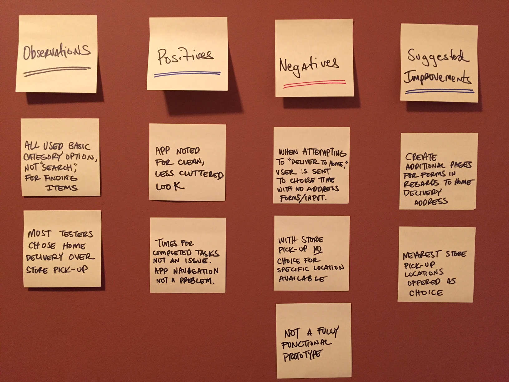
Using the Post-It Notes and tests from my participants, I pieced together a small affinity map, capturing the prototype's makeup.
I had five users play with the medium-fidelity prototype. Through InVision, I could gauge ease of use and see if they could complete a simple task of buying an apple. All users purchased the item without issue.
User Interface Design
UI Kit
Once all the branding was complete and the UI appeared solid, I crafted UI Kits (or the neatly packaged UI design patterns) to make life easier for any future designers working with the InstaShop brand.
Final Product
A clean interface and simple navigation help make the InstaShop app a success.
Learnings
- I learned about the process of creating a mobile app and a responsive website. I discovered the sheer amount of work that goes into developing solid user experience and user interface with both projects.
- During the user research process, I was surprised to see how many users completely ignored the search bar. It was developed to provide submenus to search for specific items, and though scaling it back was considered, the usability of the few who used it made it worth keeping.
- This project had a few learning challenges, but the most difficult element was working within the shorter time frame. Once I wrote out my day-to-day gameplan and increased the daily time spent on the project (an additional 45 minutes), I was able to develop ideas at a quicker pace and get them tested faster. It made for a better workflow.
- While the whole project was a huge learning experience, I especially loved iterating on designs and testing those new designs on users. It felt good to produce designs with the confidence that users would enjoy and understand it.